![]()
This chapter presents an advanced example that uses style sheets. The example web page discussed in this chapter is the home page for a fictional company called Style Sheets Ink.
You can view this page at:
styleink/index.htm
The page opens in a separate browser window. If you do not see the page after selecting the link, check your desktop in case the second browser window is hidden under this one. This chapter discusses how the However, Style Sheets Ink has also developed several alternative home pages, that each display the same content but use slightly different style sheets. To view the alternative home pages, select the following links:index.htm page uses style sheets. styleink/version1.htm
Feel free to copy any of these examples and modify them to suit your needs.
To view the web page that is discussed in this chapter, select:
styleink/index.htm
The example page opens in a separate browser window, so if you do not see it immediately, check if it is hidden under another window on your desktop. Be sure to view the sample page in a web browser that supports style sheets, such as Navigator 4.0, so you can see the full effects of the styles. The rest of this chapter discusses how style sheets are used in Style Sheets Ink's home page. The discussions include extracts of source code. However, to see the entire source code, view the page source in your web browser. The style sheet for the page uses CSS syntax. The style sheet is included at the top of the page. The Style Sheets Ink home page has several sections, including an introductory section, a training section, a web sites section, and a consultation section, which are all contained within a main block. There is also a background section which is in the back, outside the main block. The introductory section is centered in the main block, but the sections after it alternate between being on the left and the right. The example page makes extensive use of <DIV> tags to contain elements that share styles. It also illustrates how you can use a <DIV> block to draw a single border around multiple elements.
At the very top of the style sheet file, there's a link to a font definition file:
<LINK HXBURNED REL="fontdef" SRC="index.pfr">
This font definition file contains the definition for the Impact BT downloadable font, which is used in the page. (For more information about downloadable fonts, see Part 3. Downloadable Fonts.)
The style sheet defines several styles that are used in different parts of the page. For instance, the INTROBLOCK style is used for the introductory material, the TRAININGHEAD style is used for the heading in the training section, and the TRAINING style is used for the text in the training section.
However, the style sheet also defines a couple of styles that are used throughout the whole document. These include styles for the <BODY> element and for the <H1> element.
The body of the Style Sheets Ink home page has a medium blue background. This could be specified using the bgColor attribute in the <BODY> element, but Style Sheets Ink has instead specified a style for the <BODY> element:
<STYLE type="text/css">
BODY {background-color:#CCDDFF;}
Nearly all <H1> elements in the document use the same customized style, so the style sheet defines the style for first-level headings as follows:
H1 {
font-size:18pt;
font-weight:bold;
font-style:italic;
font-family:"Impress BT", "Helvetica", sans-serif;
}
The font-family property lists three fonts. The font Impress B" is defined in the font definition file index.pfr, which is automatically downloaded to the user's system when a user views the page. However, just in case the font definition file is not available for any reason, Helvetica is specified as a backup font. Many computers include Helvetica as a system font, so it is likely to be available for most users. But just in case the font definition file is not available and the user does not have Helvetica font on their system, the style specifies the generic sans-serif font family as a last resort.
Th style defines the default font size, the font weight, font style, and font family for all <H1> element in the page. It does not define the font color. Throughout the document, each <H1> element gets its color from other inherited styles. For example, the training heading is inside a <DIV> block that uses the TRAINING style. This style sets the color property to #111100 (a dark gold color). Thus the training heading gets some of its characteristics from the H1 style, and other characteristics from the TRAINING style.
The very first thing in the body of the page is a <DIV> block that contains the main content for the page.
This DIV block has a gray border and a white background. It uses the MAIN style to define its border and background: The definition of the MAIN style is:
all.MAIN {
background-color: white;
margin-left:5%; margin-right:5%;
border-color:gray; border-style:outset; border-width:6pt;
padding:20 pt;
}
The MAIN <DIV> block contains another <DIV> block. This block is the intro block, which contains the introductory information for the page. The intro block uses the style INTROBLOCK.
This style defines a flat blue border and a blue background for the intro block. The color of the border is the same as the color of the background. The style also defines the text and font characteristics to be used by all elements inside the intro block.
Here's the definition of the style class INTROBLOCK:
all.INTROBLOCK {
font-family: "new century schoolbook", serif;
font-style:italic;
font-size:12pt;
color:#000055;
background-color: #CCDDFF;
margin-left:5%; margin-right:5%;
border-color:#CCDDFF; border-style:solid;
border-width:2pt;
padding:10pt;
}
The main heading for the page is inside the intro block. It has a wide outset 3D blue border. It uses the style INTROHEAD. Here's the definition of the style class INTROHEAD:
all.INTROHEAD{
font-size:24pt;
text-align:center;
color:#000055;
background-color:#CCDDFF;
margin-left:2%; margin-right:2%;
border-color:#0055FF; border-style:outset; border-width:20pt;
padding:5pt;
}
The following code shows the first few lines in the body of the document:
<BODY >
<DIV CLASS=MAIN>
<DIV CLASS=INTROBLOCK>
<H1 CLASS=INTROHEAD>Style Sheets Ink.</H1>
The first letter of the first paragraph in the intro block needs to be extra large, so Style Sheets Ink uses a <SPAN> tag to apply the INITCAP style class to the first letter, as shown here:
<P STYLE="text-indent:0%;"><SPAN CLASS=INITCAP>W</SPAN>elcome to the
home page for our company, Style Sheets Ink,...
The following code shows the definition of the style INITCAP:
all.INITCAP {font-size:36pt;}
All the paragraphs in the intro block inherit their styles (font styles and so on, not margins or paddings) from the enclosing element, which is the DIV block that uses the INTROBLOCK style.
The text-indent property is not inherited. The first line of each paragraph in the intro block (except for the first one) needs to be indented by ten percent. This could be achieved by specifying a local style for each paragraph as follows:
<P STYLE="text-indent:10%;>content...
However, several paragraphs need to be indented. Their best plan is to define a class of style, and use that style in each paragraph as appropriate. Although the amount of typing needed ends up being about the same, it is better to use a style class. That way, you can make changes to the style definition in one place, and those changes will be automatically reflected everywhere the style is used.
Thus you can define a simple style called INTROTEXT as follows:
all.INTROTEXT{text-indent:10%;}
Each paragraph that needs to be indented uses this style, for example:
<P CLASS=INTROTEXT>
At Style Sheets Ink we believe in the power of style sheets. We are
jazzed and excited at the myriad of ways that style sheets can liven up
a web site. We provide many services to help your company come up to
speed with using style sheets, including:
</P>
The intro block includes a list of services offered by Style Sheets Ink. These services are presented in an unordered list.

Style Sheets Ink specified the SQUAREDISCS class of style for the <UL> element so it is inherited by the <LI> element inside the <UL> element. (An alternative approach would be to specify the SQUAREDISCS style class for each <LI> element.)
The following code shows the definition of the SQUAREDISCS style:
all.SQUAREDISCS {list-style-type:square; color:green;}
The following code shows the body text that lists the services:
<UL CLASS=SQUAREDISCS>
<LI><A HREF="#TRAINING">Training</A>
<LI><A HREF="#SEMINAR">Seminars</A>
<LI><A HREF="#WEBDEV">Web site development</A>
<LI><A HREF="#CONSULTATION">Consultation</A>
</UL>
At the end the intro block, there is a </DIV> tag that matches the <DIV CLASS=INTROBLOCK> tag. Notice that the border characteristics specified by the INTROBLOCK style apply to the DIV block as a whole, not to each individual element within the DIV block. Thus the entire DIV block is enclosed in a box with a blue background and a thin, flat, blue border.
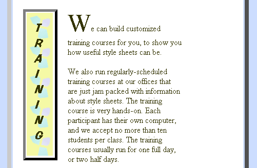
Following the intro block is the training section, which displays the training heading on the left. The information about training wraps around the heading on the right.

The entire training section is contained within a DIV block that uses the TRAINING style. This style sets the text color, the left margin, and the right margin.
The definition of the TRAINING style is:
all.TRAINING{
color:#111100;
margin-right:30%;
margin-left:5%;
}
The reason for setting the margins is to offset the contents of the training section from the edge of the surrounding block. The training section uses a floating element for the heading, and it's not wise to specify the margin-left property on an element if you also specify its float property. Therefore we put the floating heading inside a DIV block that has a left margin.
The heading for the training section floats to the left. It uses the TRAININGHEAD style, which specifies the color, the background image, the border and padding characteristics, and the float property. There's no need to specify the font size, font weight (bold) and font style (italic) since they are inherited from the style assigned to all H1 tags. There's also no need to specify the color, because it is inherited from the TRAINING style. (However, if you wanted the heading to have a different color from the body text, you would need to specify the color here.)
The following code shows the definition of the TRAININGHEAD style:
H1.TRAININGHEAD {
background-image:url(trainbg.gif);
border-color:#666600;
border-width:5pt;
border-style:outset;
padding:10pt;
float:left;
}
The vertical effect in the heading is achieved simply by putting a <BR> tag after each letter, as shown here:
<DIV CLASS=TRAINING>
<H1 CLASS=TRAININGHEAD>
T<BR>
R<BR>
A<BR>
I<BR>
N<BR>
I<BR>
N<BR>
G
</H1>
All the paragraphs within the training section inherit their characteristics from the enclosing DIV block which uses the TRAINING style. So there's no need to specify which style these paragraphs need to use.
The training text wraps around the training heading. It doesn't reach all the way to the right since the margin-right property on the TRAINING style is set to 30%.
Just before the final </P> in this section, include a <BR CLEAR> tag, to ensure that the next element will not continue wrapping around the training heading.
The following code shows the paragraphs in the training section. Note the use of the <SPAN> tag to apply the INITCAP style to the first letter in the first paragraph.
<P ><SPAN CLASS=INITCAP>W</SPAN>e can build customized training courses
for you, to show you how useful style sheets can be.
</P>
<P >We also run regularly scheduled training courses at our offices that
are just jam-packed with information about style sheets. The training
course is very hands-on. Each participant has their own computer, and we
accept no more than ten students per class. The training courses usually
run for one full day, or two half days.
<BR CLEAR>
</P>
<!-- this ends the training section -->
</DIV>
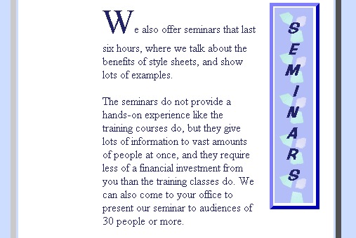
Next comes the seminars section, which is very similar in style and structure to the training section. However, since the seminars section appears on the right, the SEMINARHEAD style sets the float property to right. Also, the SEMINAR style sets the margin-left property to 30% and the margin-right property to 10%, so that the seminars section appears on the right of the main block.

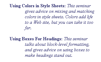
The seminar section includes a list of seminars:

The first line of each item in this list is outdented. This effect is achieved by using the SEMINARLIST style. This style sets the margin-left property and sets a text-indent value equal to minus the left margin, as shown here:
all.SEMINARLIST{margin-left:40pt; text-indent:-40pt;}
In the body text, each paragraph in the list of seminars uses the SEMINARLIST style, as shown below:
<P>Here is a list of available seminars:</P>
<P CLASS=SEMINARLIST> <B>Using Colors in Style Sheets: </B>
<I>discussion of this seminar...</I></P>
<P CLASS=SEMINARLIST> <B>Using Boxes For Headings:</B>
<I>discussion of this seminar...</I></P>
<P CLASS=SEMINARLIST> <B>Using Text Properties of Style Sheets: </B>
<I>discussion of this seminar...</I></P>
Note, however that you could achieve the same result by enclosing the paragraphs in a DIV block that uses the SEMINARLIST style, and then there would be no need to individually specify the SEMINARLIST class for each paragraph.
These two sections use the same layout and style structure as the training and seminars section.
At the bottom of the page, you see an explanatory paragraph that's in the main body of the page. This paragraph is at the top level (that is, it's directly in the BODY element.) It uses the INBACK style.
Although this paragraph is technically at the top level, it appears to live in the background, since it follows a big block with an outset 3D border.
In general, when you're working with style sheets, be sure to match opening and closing tags correctly. While web browsers are often fairly forgiving of HTML syntax mistakes, the browsers become very much stricter when style sheets are involved.
In particular, extraneous closing tags may end up closing other tags that you would not expect them to close. For example, in the code below, the extraneous </H3> tag may close the opening <DIV STYLE=INNERBLOCK> tag, and the second paragraph will thus be outside the inner block.
<DIV STYLE=INNERBLOCK>
<P>Here is some text. </P>
</H3>
<P>Here is some more text which is supposed to be in the innerblock.</P>
</DIV>
Be careful when using<A> and </A> tags in documents that use style sheets. For example, when you use DIV blocks with style sheets, don't start an <A HREF> tag before the start of the DIV block and then close it inside the DIV block, or you will get unpredictable results.
For example, the following code behaves as you would expect:
<DIV STYLE="margin-left:5%">
<A NAME="TRAINING">
<H1 CLASS=TRAININGHEAD>
content...</H1>
</A>
However, the code below has unpredictable results, because the <A HREF> and </A> tags are not in the correct places. (For example, the </A> tag may be used to close the <DIV> tag.)
<A NAME="TRAINING">
<DIV STYLE="margin-left:5%">
<H1 CLASS=TRAININGHEAD>
content...</H1>
</A>
Last Updated: 08/07/97 15:21:45